UCR Department of Computer Science
& Engineering
CS177 Notes on Q-Q Plots
Mart Molle, February 2008
I. Background
Q-Q plots are discussed on pages 334-338 in the textbook by A. M. Law (Simulation
Modeling & Analysis, 4th Ed), under the subheading Probability Plots. The discussion
focuses on using the technique to compare the cumulative PDFs for two
(assumed to be continuous) random variables, where:
- X has an empirically-derived distribution,
defined by a set of measurement data, and
- Y follows some well-known theoretical distribution
(exponential, normal, etc.).
Q-Q plots are one of several heuristics for testing "goodness of fit"
between a theoretical distribution and some empirical data, i.e., how
reasonable is it to assume that the empirical data set was generated by
sampling the chosen theoretical distribution? The principal advantage
of Q-Q plots over other heuristics is that a "good fit" is easy to
recognize. This is because the technique reduces the two separate
cumulative distribution functions for X
and Y into a simple curve on
the X-Y plane:
- If the cumulative distribution functions for X and Y belong to the same distribution family (i.e.,
they differ only by location and scale parameters), then the resulting
graph will always look like a straight line -- even if we have not yet
evaluated all the parameters for the theoretical distribution.
- If the cumulative distribution functions for X and Y belong to different distribution
families, then the resulting graph will look like a curved line.
Although the discussion in the textbook [near bottom of p. 336] assumes
the cumulative distribution function is invertible (in which case the
random variable must be continuous), it seems clear that Q-Q plots can
be used whether or not we assume that the distribution of Y is continuous. (Note, in
particular, that the PDF for X
is always discrete, because
it is based on a finite number of measurements.) For consider the
following "thought experiment'' by which we might construct the true
PDF for some random variable as the limiting case of an empirical
distribution. That is, we sample the r.v. N times and then sort the samples
into non-decreasing order. Now in the limit as N grows very large:
- The sample that appears at position N/2 in the sorted list will be the median of the distribution (i.e., half the
samples are smaller than the median and the rest larger), and
- In general, the sample that appears at position N×q will be the qth
quantile of the distribution,
for all 0 < q < 1 .
Thus, for any r.v. X,
discrete or continuous, we can find the qth quantile of its distribution as
that value xq which is the minimum in the set {x | F (x)
> q}. In other words:
- The inverse
cumulative distribution function F-1(q) is always a well defined
function that gives the limiting value of the sample at qth quantile of the
distribution of X.
- Furthermore, if F-1(q), and hence
X, is a continuous function,
then it can be inverted to give us the cumulative distribution function
for X (i.e., the unique quantile at
which a particular
value of
x would appear in an
ordered set of samples in the limit as N grows very large).
Operationally, this last statement shows that we would be better off
describing a random variable by its inverse PDFs -- even though
convention dictates the opposite! This change in perspective would have
no significant impact on continuous random variables, since the two
graphs, showing FX(x) as a function of x and FX-1(q) as a function of q, are identical except for
"flipping" the image along its main diagonal. On the other hand, if we
apply the same "flipping" to the inverse PDF for a discrete random
variable, then the resulting "staircase-like" graph of FX(x) as a function of x would include the vertical face
of each "step" but not the horizontal "tread". The advantage of this
change in perspective is clear in this application:
- For both discrete and continuous random variables and for all 0 < q < 1, the qth quantile of the
distribution for X can be
found graphically as the x-coordinate
of the intersection point (x, q) between the horizontal line y = q and the vertical line x = FX-1(q).
Thus, in terms of the inverse PDFs, a Q-Q plot for the random variables
X and Y may be defined as the locus of
points on the X-Y plane of
the form:
(FX-1(q), FY-1(q))
for all q
between 0 and 1.
Notice that the
independent
variable, q, doesn't actually appear
the graph! Moreover, if one of these functions, FY-1(q) say, happens to be invertible,
then the definition of the Q-Q plot can be simplified by eliminating
the quantile variable q from
the above expression to give:
(x, FY-1(FX(x)))
for all x over the domain of X.
In this case, the following Turing procedure could be used to generate
the Q-Q plot, assuming the empirical data (sorted into non-decreasing
order) are stored as the first n
elements as the array Data,
and the function inversePDF can
be invoked to evaluate FY-1(q):
procedure continuous_Q_Q (Data
: array 1 ..
* of real, n :
int, function inversePDF
(x :
real) : real)
for
i :
1 ..
n
put Data (i), "
", inversePDF ((i
- 0.5)
/ n) %
See text, bottom of p. 334
end for
end continuous_Q_Q
II. An Example where the Theoretical Distribution is Assumed to be
Continuous
An application of this procedure is shown in Figures 1-4. Figures 1-2
contain some empirical data collected from a very long simulation of a novel
token ring local area network. This particular run was divided into
125 batches, each containing the statistics for 91,431 packets. (Thus,
more than 11.4 million packets were delivered during the simulation).
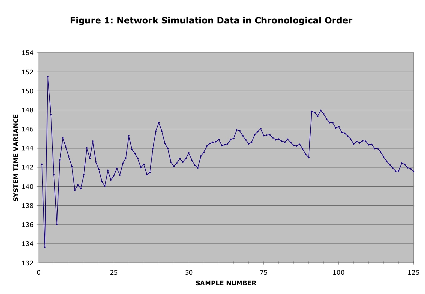
Figure 1 shows a graph of sample variance versus time for the raw data
file,
where the x-coordinate of
each point is the batch number in chronological order and the y-coordinate is the sample variance
for the packets contained in the corresponding batch.
Figure 1:
Original data present in chronological order
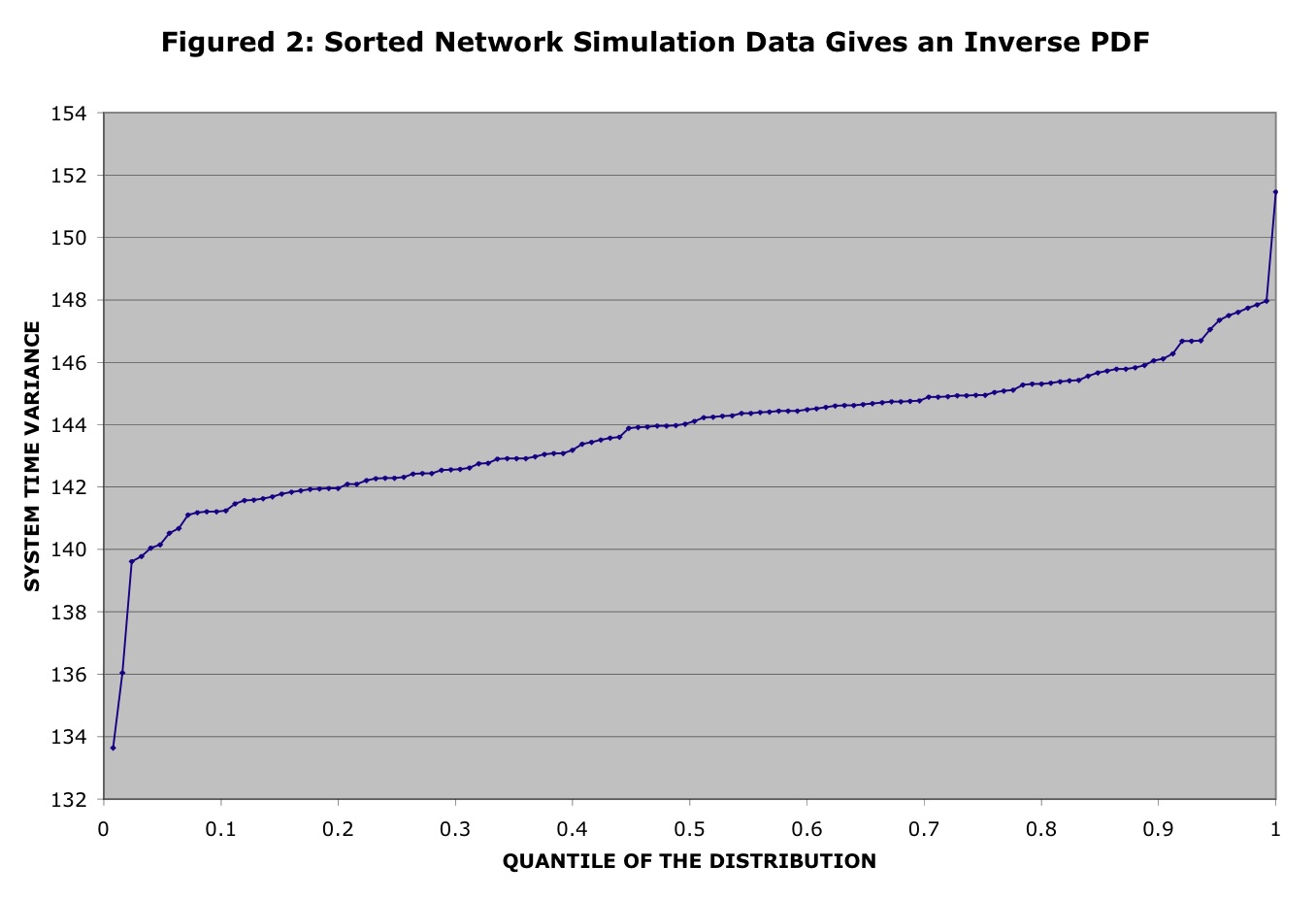
Similarly, Figure 2 shows corresponding graph for the sorted
data
file, where the same set of empirical data has been sorted into
non-decreasing order according to the sample variance to yield an
inverse PDF function:
FX-1(k/125) for all 1 < k < 125.
Figure 2:
The same data sorted into non-decreasing order
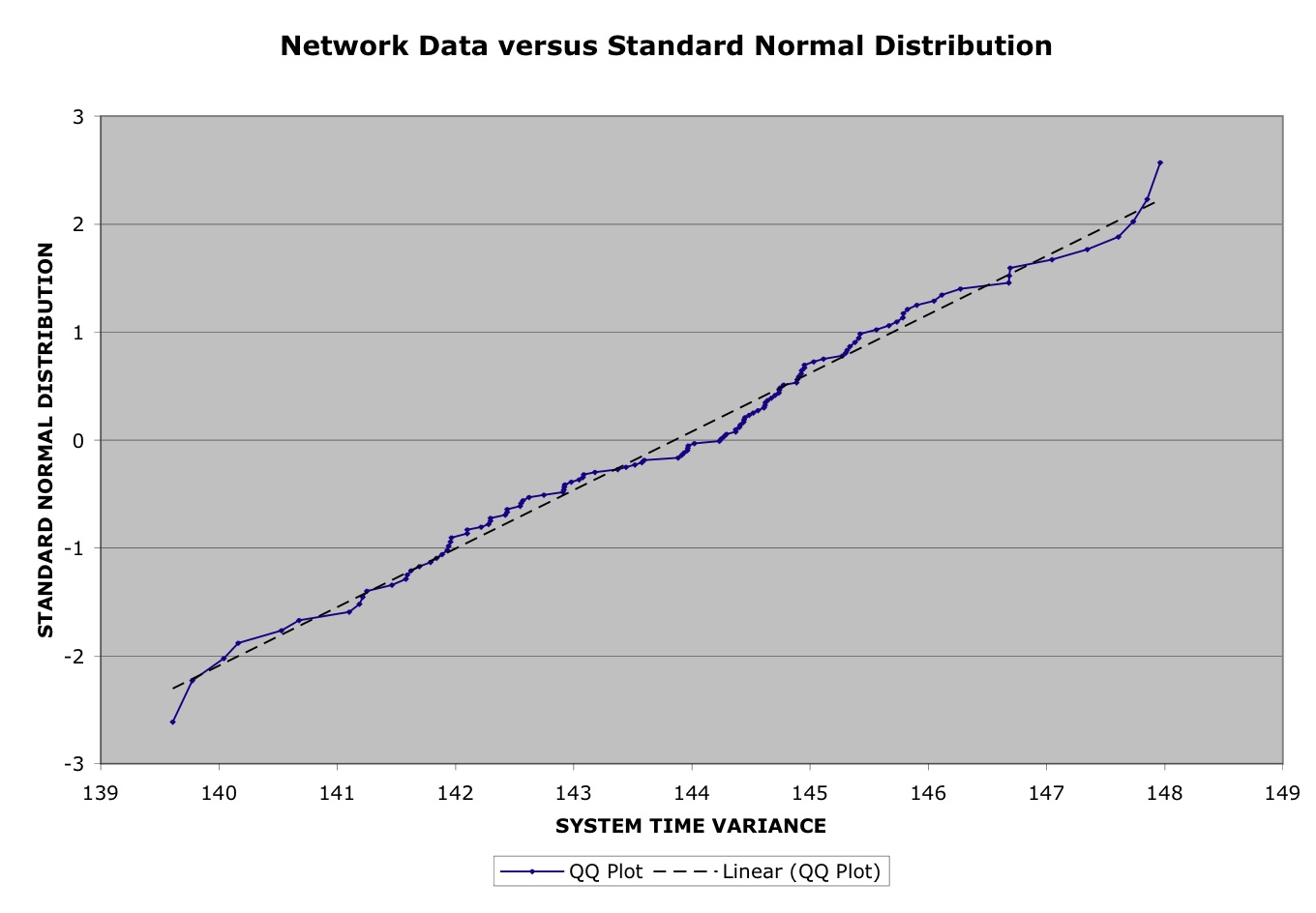
Thus, the question now is to try to "fit'' some theoretical
distribution to this data. Since each of the points is a batch
statistic (and the batch size is quite large), we expect the Central
Limit Theorem to apply, and hence that the data should have a normal
distribution. Figure 3 gives a Q-Q plot of the empirical data on the x-axis versus a standard normal
distribution on the y-axis.
(We dropped the first 10 samples from the raw data, because they do not
seem to be representative of the steady-state behaviour of the system.)
Figure 3:
Q-Q Plot of empirical data vs. Standard Normal distribution
Observe that the QQ Plot is quite straight, and closely follows the
(dashed) linear trend line, but that it doesn't pass through the
origin, nor does it have a slope of 45 degrees. Thus, we can conclude
that a normal distribution is a good fit to the data -- provided we
select the appropriate values for the mean and variance.
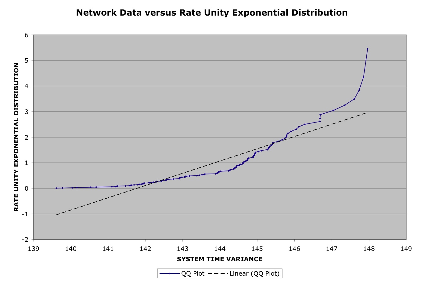
For comparison, Figure 4 gives the corresponding Q-Q plot when we
change the theoretical distribution from the Standard Normal
distribution to the exponential distribution with rate unity. This time
the QQ Plot is obviously very
different from the (dashed) linear trend line, so it is easy to see
that the exponential distribution is not a
good fit to the data.
Figure 4:
Q-Q Plot of empirical vs. exponential distribution
III. Generation of Q-Q Plots from Two Discrete Distributions
The situation is a bit more complicated when the theoretical
distribution is assumed to be discrete. For example, consider the
following pedestrian count data that was collected by my CS177 class in
2003. Over a particular one-week period, each student spent some
time counting the number of pedestrians traveling back and forth
between remote parking lot 30 and the UCR main campus at various
5-minute periods. Clearly, the number of pedestrians passing the
observation point during some observation period must be a non-negative
integer. Therefore, we should choose a theoretical distribution that is
also non-negative and integer-valued. In this case, the obvious choice
is the Poisson
distribution, which is commonly used to represent the number of
events that occur in a fixed-length interval, assuming that the events
occur independently at some constant rate.
We are now ready to describe the generation of a Q-Q Plot, assuming
that the empirical random variable X is given by a tabulated discrete n-element distribution:
{X(i) : i = 1, ..., n}with respective
cumulative probabilities FX(X(i)) = (i - 0.5) / n,
and the theoretical random variable Y
has a discrete distribution FY(y),
in which Y can take only only
m distinct values:
{yj
: j = 1, ..., m} with respective
individual probabilities pj and cumulative
probabilities FY(yj).
Without worrying about program efficiency, we could generate the Q-Q
Plot simply letting q
increase from 0 to 1 in infinitessimally small steps, and for each
chosen value of q, we add the
point (X(i), yj)
to the graph, where:
- X(i) is chosen so that FX(X(i-1)) < q < FX(X(i)), and
- yj is chosen so that FY(yj-1)
< q < FY(yj).
Unfortunately, however, the same point (X(i), yj)
gets added
to the graph many times, since the inverse PDFs are piecewise
constant over a range of q values.
For example, the point (X(1),
y1) is
chose for every value of q
between 0 and min {0.5 / n, p1}.
Conversely, it is easy to see that the algorithm can never generate
more than n+m distinct points. To see this, we
observe that the x-coordinate
of the intersection point between the horizontal line y = q and a "staircase-like" discrete
cumulative distribution function F(x) only changes as q hits the top of each of its
"steps". Therefore, to speed up the algorithm and avoid generating all
those duplicate points, we will construct an "event driven
simulation" of a program that increases q continuously. In this case, the
value of q jumps directly
from the top of one "step" to the next, where it generates a single
copy of the point (FX-1(q), FY-1(q)). Here is
an implementation of this technique, in the form of a Turing subprogram:
procedure integer_Q_Q_Plot (sortedData : array 1
.. * of int, n : int, PDF
: array 1
.. * of record
value : int
cumulative_prob : real
end record)
% Perform an "event driven
simulation" of the result of trying to construct a q-q plot of two
integer valued PDFs
% by letting q increase smoothly from
0 to 1 and then listing the sequence of (Y, X) pairs that are generated
% by the intersections of the two
PDFs with the line Y=q.
const TOL := 0.95 % magic constant, keeps us out of
trouble if the theoretical distribution has a long tail
var j
: int := 1
% index across possible values for the theoretical distribution
var Y
: int := PDF (j) .value %
theoretical Y, non-negative integer valued
var Yq
:= PDF (j).cumulative_prob %
next critical quantile for Y
% Now Y = the min value for which the r. v. has some mass, and Yq = the
corresponding cutoff point for the PDF
var X : int := sortedData (1) %
empirical X, non-negative integer valued
var Xq
:= 1 %
n times the next critical quantile for X
loop
exit
when Xq = n or sortedData (Xq + 1) not= X
Xq += 1
end loop
% Similarly, X = the min value for which the empirical data has some
mass, and Xq / n is the corresponding cutoff point
loop
put Y,
" ", X
exit
when Xq = n and (Yq >
TOL or
j = upper (PDF))
if Xq /
n < Yq then
% X crosses a critical
quantile first, so advance to the next cutoff point
loop
Xq += 1
exit
when Xq = n
or sortedData (Xq + 1) not= sortedData (Xq)
end
loop
X := sortedData (Xq)
elsif Yq
< Xq / n then % Y crosses a critical quantile first, so
advance to its next value
j += 1
Y
:= PDF (j) .value
Yq
:= PDF (j).cumulative_prob
else % both hit a critical quantile together
loop
Xq +=
1
exit when Xq =
n or sortedData (Xq + 1) not= sortedData (Xq)
end loop
X := sortedData (Xq)
j += 1
Y
:= PDF (j) .value
Yq
:= PDF (j).cumulative_prob
end if
end loop
end integer_Q_Q_Plot
Let us now return to the pedestrian count example introduced at the
beginning of this section. The raw data collected by students is
available on sheet 1 of this Excel spreadsheet,
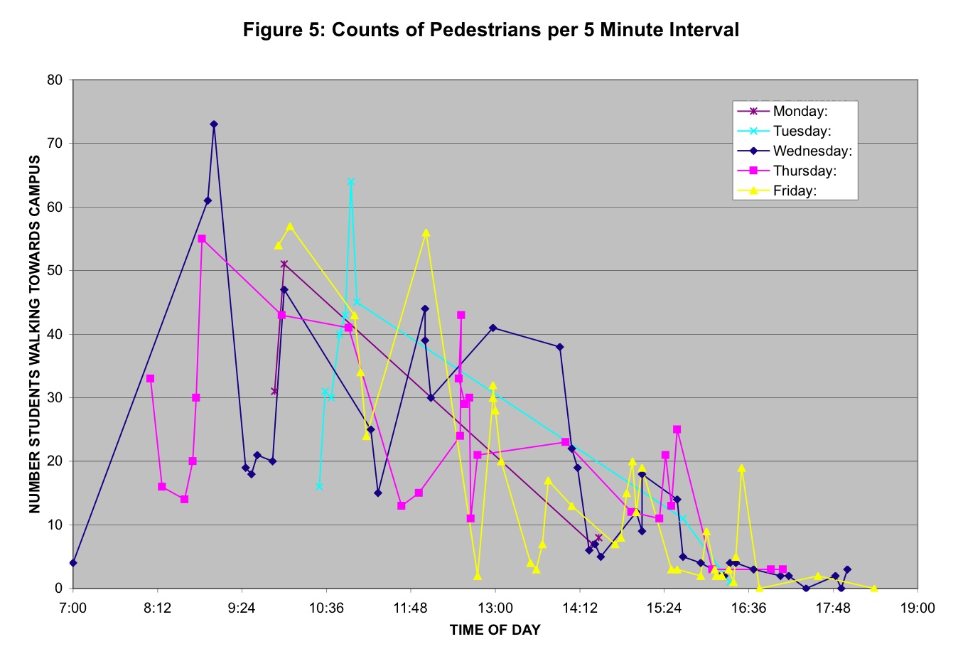
while figure 5 plots the number of pedestrians travelling towards campus
per 5-minute interval as as a function of time-of-day. The data in this
figure is rather messy and shows a high degree of non-stationarity in
terms of both a general downward trend (i.e., most students come to
campus in the morning) and periodicity (i.e., the counts tend to
increase significantly at the boundary between class timeslots, which
happen on the hour on Monday-Wednesday-Friday, and once every 90
minutes on Tuesday-Thursday).
Figure 5:
5-Minute Pedestrian Counts as a Function of Time-of-Day
Notice that the pedestrian count data collected between 1pm and 4pm
seems relatively stable, so we shall limit our attention to this
"afternoon data" subset of the raw data. After reviewing a sorted copy
of the afternoon data (found on sheet 2 of the spreadsheet), it is
evident that one point (38 pedestrians, collected at 1:55pm on
Wednesday -- and hence just ahead of a class timeslot) should be
discarded becuase it is so different from the other 37 samples -- where
the pedestrian count distribution has average is 11.7 and maximum of
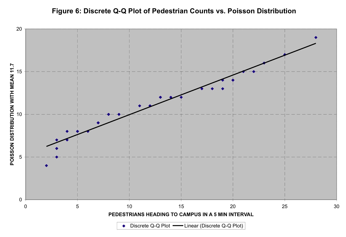
28. Figure 6 shows a discrete Q-Q Plot comparing the afternoon
data to a Poisson distribution with mean 11.7. Notice that the graph is
a set of disconnected points and not
a continuous curve, since neither random variable can ever take on any
non-integral values. However, the points are surprisingly-well
clustered
along the linear trend line, considering the messiness of the data.
Figure 6:
Discrete Q-Q Plot of Fitting a Poisson Distribution to the Pedestrian
Counts
At first glance, the linearity of figure 6 seems to validate our choice
of Poisson for the theoretical distribution: a straight line indicates
that the empirical and theoretical distributions belong to the same
"family", i.e., they have the same shape but might have different
values for a location parameter (if the line does not pass through the
origin) and/or a scale parameter (if the slope of the line is not 45
degrees). However, even though we set the mean of the Poisson
distribution to the mean pedestrian count, neither the y-intercept
nor the slope of the line matches the "ideal" value so this Poisson
distribution is not a perfect match. Unfortunately, the Poisson
distribution has only one adjustable parameter (its mean), making it
impossible to force the Q-Q Plot to become a 45 degree straight line
through the origin. Therefore, we must ultimately reject the Poisson
distribution for modeling the "afternoon data". The reason for this
failure can be seen from a comparison of the two cumulative
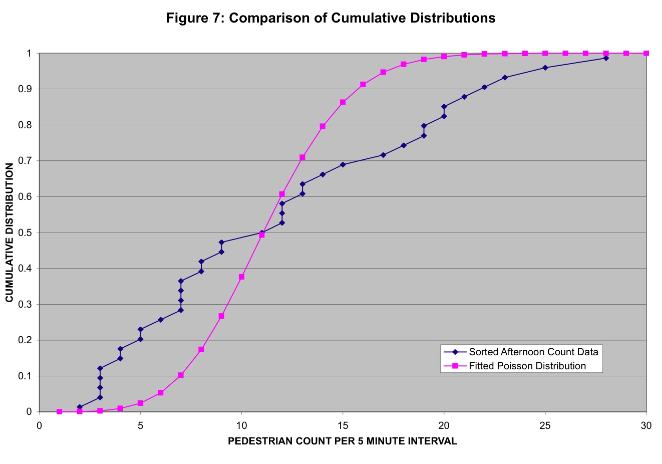
distribution functions, as shown in figure 7.
Figure 7:
Cumulative Distributions for
"afternoon data" and Poisson with Same Mean.
The empirical PDF for the
empirical PDF for the afternoon data rises much more gradually than the
PDF for the Poisson distribution with the same mean. This is because
the variance of the "afternoon data" is significantly higher than the
variance of the Poisson distribution. Since the mean and variance are
always equal for the Poisson distribution, this discrepancy can only be
fixed by choosing a different theoretical distribution.