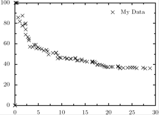
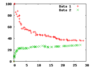
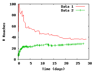
Plot styles
How about changing plot styles from points to lines or linespoints?
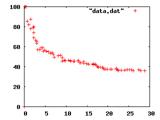
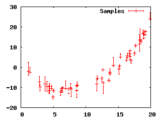
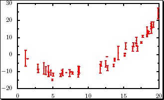
gnuplot> plot "data.dat" title "Data 1" with lines, "data2.dat" title "Data 2" with linespoints
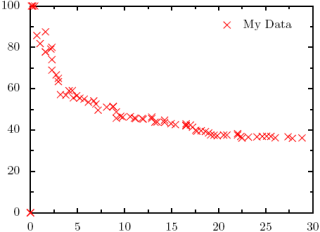
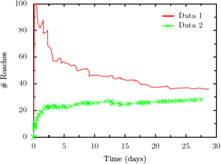
 This gets a little more complicated, but not too bad. We return to
plotting one line at a time. This is not the most simple
invocation for doing this (I'm adding in a few extra options), but I
am taking this opportunity to show off a few extra features that you
ought to be able to generalize from.
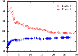
This gets a little more complicated, but not too bad. We return to
plotting one line at a time. This is not the most simple
invocation for doing this (I'm adding in a few extra options), but I
am taking this opportunity to show off a few extra features that you
ought to be able to generalize from.
from pyx import *
# Initialize graph object
g = graph.graphxy(width=8, ratio=4./3, key=graph.key.key())
# Plot the first line
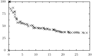
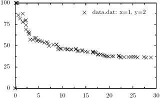
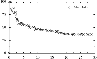
g.plot(graph.data.file("data.dat", x=1, y=2, title="Data 1"),
styles=[graph.style.line([color.rgb.red,
style.linestyle.solid,
style.linewidth.thick])])
# Plot the second line
g.plot(graph.data.file("data2.dat", x=1, y=2, title ="Data 2"),
styles=[graph.style.line([color.rgb.green,
style.linestyle.solid,
style.linewidth.thick]),
graph.style.symbol(symbolattrs=[color.rgb.green])])
# Write the output
g.writePDFfile("test")
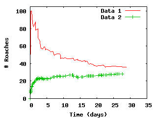
Axis Labels and Scales
Again, common and easy features in Gnuplot that turn out to be almost
as easy in PyX. Lets add labels to our graphs so we know what the
axes represent.
gnuplot> set ylabel "# Roaches"
gnuplot> set xlabel "Time (days)"
gnuplot> plot "data.dat" title "Data 1" with lines, "data2.dat" title "Data 2" with linespoints
 And the equivalent in PyX. The only thing to watch out for here is
the calls down to LaTeX.
And the equivalent in PyX. The only thing to watch out for here is
the calls down to LaTeX.
from pyx import *

# Initialize graph object
g = graph.graphxy(width=8, ratio=4./3, key=graph.key.key(),
                  x=graph.axis.linear(title="Time (days)"),
		  y=graph.axis.linear(title="$\#$ Roaches"))

# Plot the first line
g.plot(graph.data.file("data.dat", x=1, y=2, title="Data 1"),
       styles=[graph.style.line([color.rgb.red,
                                 style.linestyle.solid,
                                 style.linewidth.thick])])

# Plot the second line
g.plot(graph.data.file("data2.dat", x=1, y=2, title ="Data 2"),
       styles=[graph.style.line([color.rgb.green,
                                 style.linestyle.solid,
                                 style.linewidth.thick]),
               graph.style.symbol(symbolattrs=[color.rgb.green])])

# Write the output
g.writePDFfile("test")
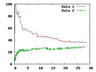
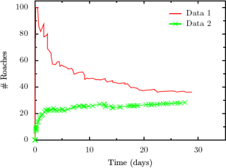
 How about if we want to bump the ranges for the plots a little?
gnuplot> set ylabel "# Roaches"
gnuplot> set xlabel "Time (days)"
gnuplot> set xrange [0 to 35]
gnuplot> set yrange [0 to 105]
gnuplot> plot "data.dat" title "Data 1" with lines, "data2.dat" title "Data 2" with linespoints
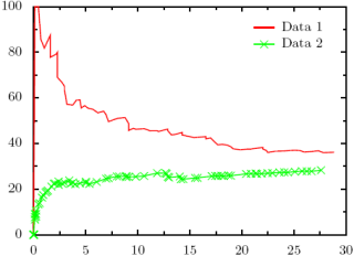
 Again, in PyX, very easy.
from pyx import *

# Initialize graph object
g = graph.graphxy(width=8, ratio=4./3, key=graph.key.key(),
                  x=graph.axis.linear(min=0, max=35, title="Time (days)"),
		  y=graph.axis.linear(min=0, max=105, title="$\#$ Roaches"))

# Plot the first line
g.plot(graph.data.file("data.dat", x=1, y=2, title="Data 1"),
       styles=[graph.style.line([color.rgb.red,
                                 style.linestyle.solid,
                                 style.linewidth.thick])])

# Plot the second line
g.plot(graph.data.file("data2.dat", x=1, y=2, title ="Data 2"),
       styles=[graph.style.line([color.rgb.green,
                                 style.linestyle.solid,
                                 style.linewidth.thick]),
               graph.style.symbol(symbolattrs=[color.rgb.green])])

# Write the output
g.writePDFfile("test")
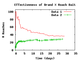
Graph Titles
Definitely one of the least-elegant Gnuplot-equivalents for PyX,
adding a title to a graph is actually making use of PyX's capability
to add text anywhere on a graph. Don't like the default key?
Make a new one. Want to add labels right onto a graph? Do it. Don't
want vertical text for your y-label? Do it by hand. The ability to
typeset text right onto your graph can be very handy, but that comes
with a price: it is a little clunky from time to time.
gnuplot> set ylabel "# Roaches"
gnuplot> set xlabel "Time (days)"
gnuplot> set xrange [0 to 35]
gnuplot> set yrange [0 to 105]
gnuplot> set title "Effectiveness of Brand X Roach Bait"
gnuplot> plot "data.dat" title "Data 1" with lines, "data2.dat" title "Data 2" with linespoints
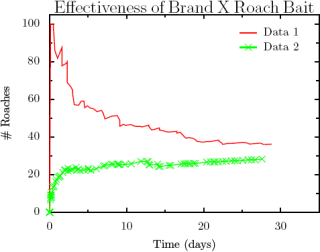
from pyx import *

# Initialize graph object
g = graph.graphxy(width=8, ratio=4./3, key=graph.key.key(),
                  x=graph.axis.linear(min=0, max=35, title="Time (days)"),
		  y=graph.axis.linear(min=0, max=105, title="$\#$ Roaches"))

# Plot the first line
g.plot(graph.data.file("data.dat", x=1, y=2, title="Data 1"),
       styles=[graph.style.line([color.rgb.red,
                                 style.linestyle.solid,
                                 style.linewidth.thick])])

# Plot the second line
g.plot(graph.data.file("data2.dat", x=1, y=2, title ="Data 2"),
       styles=[graph.style.line([color.rgb.green,
                                 style.linestyle.solid,
                                 style.linewidth.thick]),
               graph.style.symbol(symbolattrs=[color.rgb.green])])

# Now plot the text, horizontally centered
g.text(g.width/2, g.height + 0.2, "Effectiveness of Brand X Roach Bait",
       [text.halign.center, text.valign.bottom, text.size.Large])

# Write the output
g.writePDFfile("test")
Plotting Functions
One example that a reader contributed was graphing points defined by a
file but modified functionally. For example, in Gnuplot:
plot "data.dat" title "Data 1" with lines title "Data 1"
 And it is roughly the same in PyX (thanks to Kipton Barros for the
tip):
And it is roughly the same in PyX (thanks to Kipton Barros for the
tip):
from pyx import *

# Initialize graph object
g = graph.graphxy(width=8, ratio=4./3, key=graph.key.key())
g.plot(graph.data.file("data.dat", x=1, y="$2/2", title="Data 1"),
       styles=[graph.style.line([color.rgb.red,
                                 style.linestyle.solid,
                                 style.linewidth.thick])])
g.writePDFfile("test")
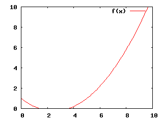
Another common use for Gnuplot is to plot a function, be it purely
mathematical or a best-fit for your data. (It is worth noting that
PyX has no substitute for Gnuplot's "fit" capabilities if you are
working with best-fit functions.)
set xrange [0:10]
set yrange [0:10]

f(x) = .2 * x**2 - x + 1
plot f(x)
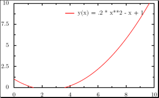
 The equivalent in PyX is easy if you've been following along, although
certainly more typing.
The equivalent in PyX is easy if you've been following along, although
certainly more typing.
from pyx import *

# Initialize graph object
g = graph.graphxy(width=8,
                  key=graph.key.key(),
                  x=graph.axis.linear(min=0, max=10),
                  y=graph.axis.linear(min=0, max=10))

# Plot the function
g.plot(graph.data.function("y(x) = .2 * x**2 - x + 1"),
       styles=[graph.style.line([color.rgb.red,
                                 style.linestyle.solid,
                                 style.linewidth.thick])])

# Write pdf
g.writePDFfile("test.pdf")
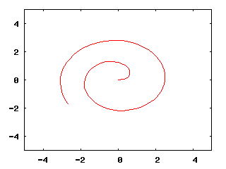
 How about parametric plots?
set parametric

set xrange[-5:5]
set yrange[-5:5]
set trange[0:10]
unset key

x(t) = cos(t) * t**.5
y(t) = sin(t) * t**.5

plot x(t),y(t)
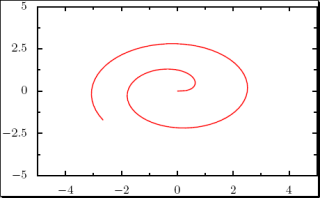
 In PyX, we start to see some of the power of Python showing through.
import math

def x(k):
    return math.cos(k) * k**.5

def y(k):
    return math.sin(k) * k**.5

# Initialize graph object
g = graph.graphxy(width=8,
                  x=graph.axis.linear(min=-5, max=5),
                  y=graph.axis.linear(min=-5, max=5))


# Plot the function
kMin = 0
kMax = 10

# The "context" parameter is a Python context, allowing us
# to use functions locally defined in this function. OR
# we can make the string "x, y = x(k), y(k)" into a more complex
# Python expression (it is being passed to eval() under the hood.)
g.plot(graph.data.paramfunction("k", kMin, kMax,
                                "x, y = x(k), y(k)",
                                context=locals()),
       styles=[graph.style.line([color.rgb.red,
                                 style.linestyle.solid,
                                 style.linewidth.thick])])

# Write pdf
g.writePDFfile("test.pdf")
 Or how about something that Gnuplot can't do: multiple parametric
curves with differing ranges? (Gnuplot only allows one range for the
parametric value t at a time, so all functions being plotted
must be written with the same range in mind. PyX has no such limitation.)
Or how about something that Gnuplot can't do: multiple parametric
curves with differing ranges? (Gnuplot only allows one range for the
parametric value t at a time, so all functions being plotted
must be written with the same range in mind. PyX has no such limitation.)
import math

def x(k):
    return math.cos(k) * k**.5

def y(k):
    return math.sin(k) * k**.5

# Initialize graph object
g = graph.graphxy(width=8,
                  x=graph.axis.linear(min=-5, max=5),
                  y=graph.axis.linear(min=-5, max=5))


# Plot the function
kMin = 0
kMax = 10
g.plot([graph.data.paramfunction("k", kMin, kMax,
                                 "x, y = x(k), y(k)",
                                 context=locals()),
        graph.data.paramfunction("k", 0, 20,
                                 "x, y = 3+x(k), 1-y(k)",
                                 context=locals())],
       styles=[graph.style.line([color.gradient.RedBlue,
                                 style.linestyle.solid,
                                 style.linewidth.thick])])


# Write pdf
g.writePDFfile("test.pdf")
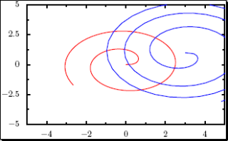 With sufficient linear scaling of the parametric value, Gnuplot could
be coaxed into plotting a graph like the one above.
With sufficient linear scaling of the parametric value, Gnuplot could
be coaxed into plotting a graph like the one above.